
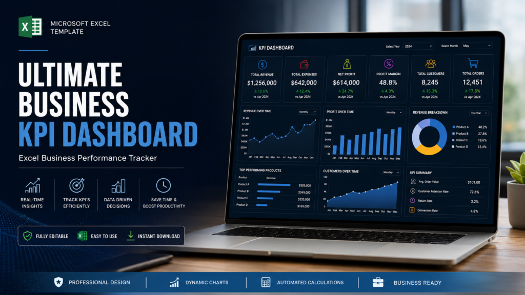
Business owners and managers have access to more data than ever.
Sales transactions, expenses, customer information, financial statements, marketing results, inventory, and operational data can all provide valuable information about how a business is performing.
The challenge is turning all of that information into something easy to understand.
This is where a business KPI dashboard can help.
A KPI dashboard brings important business metrics together in one place, allowing business owners and managers to quickly evaluate performance, identify trends, spot potential problems, and make informed decisions.
For small businesses, an Excel-based KPI dashboard can be a practical way to start tracking performance without implementing a complicated business intelligence system.
What Is a Business KPI Dashboard?
A business KPI dashboard is a visual reporting tool that displays a company’s most important Key Performance Indicators (KPIs) in a centralized location.
Instead of reviewing multiple reports or spreadsheets, management can use a dashboard to quickly see important information such as:
- Revenue
- Expenses
- Gross profit
- Net profit
- Profit margins
- Sales growth
- Cash flow
- Customer growth
- Budget variance
- Operational performance
The purpose of a dashboard is not simply to display numbers.
Its purpose is to make important information easy to understand and actionable.
What Does KPI Stand For?
KPI stands for Key Performance Indicator.
A KPI is a measurable value used to evaluate performance against a specific business objective.
For example, if a company wants to increase revenue, revenue growth may be an important KPI.
If the objective is to improve profitability, net profit margin may be more useful.
If the company wants to improve cash management, operating cash flow could be an important KPI.
The most effective dashboards therefore focus on KPIs that are directly connected to business goals.
Why Is a KPI Dashboard Important?
A well-designed KPI dashboard can provide several benefits.
1. Faster Performance Review
Instead of manually reviewing multiple reports, management can view key metrics from one centralized dashboard.
This makes routine performance reviews faster and more efficient.
2. Better Decision Making
A dashboard provides a clear view of current performance.
For example, if revenue is increasing but profit margin is declining, management can investigate rising costs or pricing issues.
3. Easier Trend Identification
Charts and historical comparisons make it easier to identify trends.
A single month’s result may not tell you much.
However, a six- or twelve-month trend can reveal whether performance is improving or deteriorating.
4. Early Problem Detection
A sudden change in a KPI can act as an early warning signal.
Examples include:
- Falling sales
- Increasing expenses
- Declining margins
- Lower cash flow
- Higher customer acquisition costs
- Increasing accounts receivable
Identifying these changes early gives management more time to respond.
What KPIs Should a Business Track?
There is no universal list of KPIs that every business should use.
The right metrics depend on the business model, industry, size, and objectives.
However, financial KPIs are a useful starting point for many businesses.
1. Revenue
Revenue represents the amount of income generated from business activities before expenses are deducted.
Tracking revenue over time can help answer:
- Are sales growing?
- Which months are strongest?
- Is revenue meeting expectations?
- How does current revenue compare with previous periods?
Revenue is usually one of the most visible metrics on a business dashboard.
2. Revenue Growth Rate
Revenue growth measures how quickly sales are increasing or decreasing over time.
A basic calculation is:
Revenue Growth Rate = (Current Revenue − Previous Revenue) ÷ Previous Revenue × 100
For example, if revenue increased from $40,000 to $50,000:
($50,000 − $40,000) ÷ $40,000 × 100 = 25%
The business experienced 25% revenue growth.
3. Gross Profit
Gross profit measures the amount remaining after subtracting the direct costs associated with producing or delivering goods and services.
Gross Profit = Revenue − Cost of Goods Sold
Gross profit helps management understand how effectively the business generates profit from its core products or services before operating expenses.
4. Gross Profit Margin
Gross profit margin expresses gross profit as a percentage of revenue.
Gross Profit Margin = Gross Profit ÷ Revenue × 100
For example, if a business generates $100,000 in revenue and has $60,000 in gross profit:
Gross Profit Margin = 60%
Monitoring this KPI can help identify changes in pricing, product costs, or sales mix.
5. Net Profit
Net profit represents the amount remaining after all applicable expenses have been deducted from revenue.
It provides a high-level view of the business’s overall profitability.
However, net profit should not be analyzed in isolation.
A business should also examine profit margins, cash flow, and changes in expenses.
6. Net Profit Margin
Net profit margin measures how much of each dollar of revenue remains as net profit.
Net Profit Margin = Net Profit ÷ Revenue × 100
For example, if a business generates $100,000 in revenue and $15,000 in net profit:
Net Profit Margin = 15%
Tracking this KPI over time can help determine whether business profitability is improving.
7. Operating Expenses
Operating expenses include the costs associated with running the business.
Examples include:
- Salaries
- Rent
- Software
- Insurance
- Marketing
- Professional services
- Utilities
- Office expenses
Tracking operating expenses can help management identify spending trends and areas where costs may need closer attention.
8. Cash Flow
Cash flow measures the movement of cash into and out of the business.
A company can report a profit and still experience cash-flow pressure.
That’s why cash flow deserves its own place on a business dashboard.
A dashboard can help management monitor:
- Cash inflows
- Cash outflows
- Operating cash flow
- Cash balance
- Monthly cash trends
9. Budget Variance
Budget variance compares actual performance with planned or budgeted performance.
For example:
| KPI | Budget | Actual | Variance |
|---|---|---|---|
| Revenue | $100,000 | $108,000 | +$8,000 |
| Expenses | $60,000 | $65,000 | -$5,000 |
| Net Profit | $40,000 | $43,000 | +$3,000 |
This allows management to quickly identify where actual results differ from expectations.
What Should a Business KPI Dashboard Look Like?
A useful dashboard should prioritize clarity.
A typical layout could include:
Top Section: KPI Cards
Display the most important metrics prominently.
For example:
- Total Revenue
- Gross Profit
- Net Profit
- Gross Margin
- Net Margin
- Cash Flow
Middle Section: Trends
Use charts to show:
- Revenue trends
- Profit trends
- Expense trends
- Cash-flow trends
Bottom Section: Detailed Analysis
Include:
- Budget versus actual
- Expense categories
- Product performance
- Monthly comparisons
- Variance analysis
The exact design can vary, but the dashboard should make important information easy to locate.
Business KPI Dashboard vs. Financial Dashboard
These two concepts are closely related but are not always identical.
A financial dashboard focuses primarily on financial performance.
It may include:
- Revenue
- Expenses
- Profit
- Cash flow
- Assets
- Liabilities
- Financial ratios
A business KPI dashboard can have a broader scope.
In addition to financial metrics, it may include:
- Customers
- Sales performance
- Marketing metrics
- Operational KPIs
- Employee metrics
- Product performance
In other words, a financial dashboard can be part of a broader business KPI dashboard.
Can You Build a KPI Dashboard in Excel?
Yes.
Excel provides many of the features needed to build a useful KPI dashboard, including:
- Formulas
- Tables
- PivotTables
- Charts
- Conditional formatting
- Data validation
- Filters
- Interactive reporting
- Financial calculations
For many small businesses, Excel is an accessible starting point for KPI tracking.
A structured Excel dashboard can combine raw business data with formulas and visual reports so that management can review performance more efficiently.
How to Build a Business KPI Dashboard in Excel
A simple process can be divided into several steps.
Step 1: Define Business Objectives
Start by identifying what the business is trying to accomplish.
Examples:
- Increase revenue
- Improve profitability
- Reduce expenses
- Improve cash flow
- Increase customer retention
Step 2: Select Relevant KPIs
Choose metrics that directly support those objectives.
Avoid adding KPIs simply because they are available.
Every metric should have a purpose.
Step 3: Collect and Organize Data
Create a consistent data structure.
Depending on the business, this may include:
- Date
- Transaction
- Product
- Customer
- Revenue
- Cost
- Expense category
- Department
Consistent data is essential for accurate reporting.
Step 4: Calculate KPIs
Use formulas or analytical tools to calculate the selected metrics.
For example:
Gross Margin = Gross Profit ÷ Revenue × 100
Net Margin = Net Profit ÷ Revenue × 100
Revenue Growth = (Current Revenue − Previous Revenue) ÷ Previous Revenue × 100
Step 5: Create Visualizations
Use charts to make trends easier to understand.
Common choices include:
- Line charts
- Column charts
- Bar charts
- Doughnut charts
- KPI cards
Choose the visualization based on what you want the user to understand.
Step 6: Add Comparisons
Comparisons make KPI data more meaningful.
Consider comparing:
- Current month vs. previous month
- Current year vs. previous year
- Actual vs. budget
- Current quarter vs. previous quarter
Step 7: Review the Dashboard Regularly
A dashboard only becomes useful when it is reviewed consistently.
Management can use weekly or monthly reviews to identify:
- Positive trends
- Negative trends
- Variances
- Risks
- Opportunities
- Required actions
Common KPI Dashboard Mistakes
Tracking Too Many KPIs
A dashboard with 50 metrics can become difficult to understand.
Focus on the KPIs that matter most.
Using Unreliable Data
A visually impressive dashboard cannot compensate for incorrect or incomplete source data.
Always verify the underlying information.
Ignoring Historical Trends
Looking only at current performance can hide important changes.
Include historical data where possible.
Focusing Only on Revenue
Revenue is important, but it does not tell you whether the business is profitable.
Track revenue alongside costs, margins, and cash flow.
Making the Dashboard Too Complicated
A dashboard should simplify information.
If users need extensive training just to understand the dashboard, the design may need to be simplified.
How Often Should You Review Business KPIs?
The appropriate frequency depends on the KPI.
Some metrics may benefit from frequent monitoring.
For example:
- Daily sales
- Website conversions
- Cash position
- Inventory levels
Other metrics may be more appropriate for weekly or monthly reviews.
For example:
- Gross margin
- Net profit
- Operating expenses
- Budget variance
- Customer profitability
A practical approach is to monitor important operational metrics regularly while conducting a more comprehensive financial KPI review each month.
How to Turn KPI Data Into Decisions
The real value of a KPI dashboard comes from what happens after the numbers are reviewed.
Consider this example:
Revenue: Up 12%
Expenses: Up 20%
Net Profit: Down 5%
At first glance, the business may appear to be growing because revenue increased.
However, the dashboard reveals that expenses are growing significantly faster than revenue.
Management can then investigate:
- Which expenses increased?
- Were the increases planned?
- Are the additional expenses generating additional revenue?
- Can unnecessary costs be reduced?
- Has profitability changed across products or services?
This turns the dashboard from a reporting tool into a decision-making tool.
The Best KPI Dashboard Is One You Actually Use
A dashboard does not need to be extremely complex to be valuable.
A simple dashboard that is:
- Accurate
- Updated regularly
- Easy to understand
- Focused on important KPIs
- Connected to business objectives
can be more useful than a highly complicated reporting system that nobody regularly reviews.
The objective should always be to make business performance easier to understand.
Final Thoughts
A business KPI dashboard provides a centralized way to monitor the metrics that matter most to a company.
For small businesses, it can help simplify financial and operational reporting while making important trends and variances easier to identify.
Start with a small number of meaningful KPIs.
Track them consistently.
Compare actual performance with historical results and expectations.
Then use the information to make decisions.
Whether you use Excel or a dedicated business intelligence platform, the fundamental principle remains the same:
Measure what matters, understand what changed, and take action.
Explore Business Analytics Tools from BizAnalyticsMBA
At BizAnalyticsMBA, we provide practical business analytics and financial tools designed to help businesses organize information, track important KPIs, and understand financial performance.
Explore our collection of business KPI dashboards, financial dashboards, Excel templates, budgeting tools, and business analytics resources to create a more structured approach to business performance tracking.
Frequently Asked Questions
What is a business KPI dashboard?
A business KPI dashboard is a centralized reporting tool that displays important performance indicators in an easy-to-understand format.
What are the most important business KPIs?
Common KPIs include revenue, revenue growth, gross profit, gross margin, net profit, net profit margin, operating expenses, cash flow, and budget variance.
Can I create a KPI dashboard in Excel?
Yes. Excel provides formulas, PivotTables, charts, conditional formatting, and other features that can be used to create KPI dashboards.
How many KPIs should a dashboard have?
There is no fixed number. A good dashboard should focus on the KPIs that are most relevant to the business objectives rather than trying to display every available metric.
What is the difference between a KPI and a metric?
A metric is a measurable data point. A KPI is a metric that has been selected because it is particularly important for evaluating progress toward a business objective.
Why should small businesses use KPI dashboards?
KPI dashboards can help small businesses monitor performance, identify trends, detect potential problems, and make decisions using organized business data.
How often should KPIs be updated?
The appropriate frequency depends on the KPI and business. Operational metrics may need frequent updates, while many financial KPIs can be reviewed weekly or monthly.
What makes a good KPI dashboard?
A good KPI dashboard is accurate, clear, focused, easy to update, and directly connected to the organization’s business objectives.